DURHAM BULLS
DURHAM BULLS
-
Collaborated with the Durham Bulls on an innovative and impactful initiative aimed at benefiting a local organization in Durham, NC. Entrusted with the responsibility of conceptualizing and designing a distinctive jersey intended to be worn by the Durham Bulls baseball players. The resulting jerseys were subsequently auctioned off, with all proceeds directed towards supporting the North Carolina Coalition Against Domestic Violence.
-
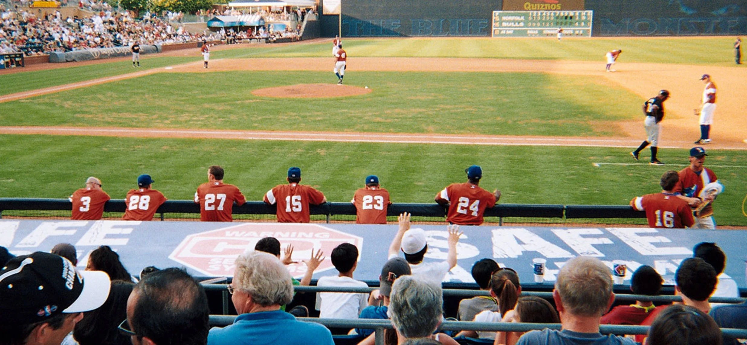
The renowned AAA Minor League baseball team, the Durham Bulls, sought to commemorate the birthday of their beloved mascot, Wool E. Bull. The task at hand was to create a distinctive and unique jersey that not only served the purpose of fundraising for a charitable cause but also met the criteria for being worn during a game day. The jersey required a balance of playfulness and creativity, incorporating elements that reflected the identity of the renowned athletic organization while paying homage to a deserving charitable cause.
-
Durham Bulls Retro Jersey
Upon a thorough examination of the challenges presented, I conducted an in-depth analysis of previous jersey designs to understand various conceptual approaches. Following extensive research, several key observations emerged, guiding my final design direction.

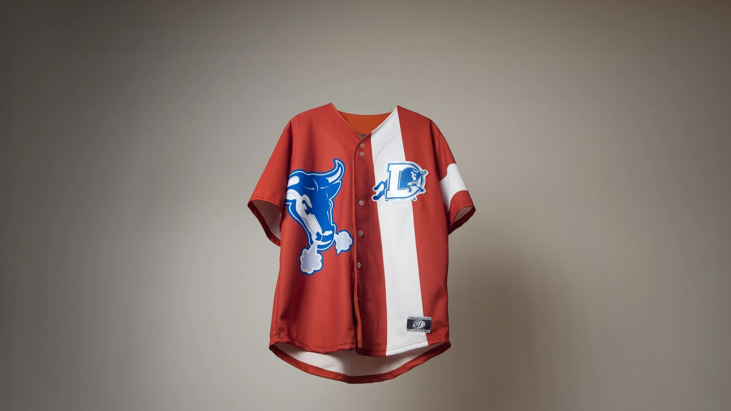
Notably, it was evident that no prior designer had ventured into the realm of a "Retro" jersey. Recognizing the potential in this unexplored avenue, I found it to be an interesting direction to pursue. The concept aligned with my vision of creating a design that resonated with the character of the city and the renowned Bulls organization, both of which boast a rich history. My aim was to encapsulate elements of this storied history within the design.

To infuse a playful element into the design, in keeping with the organization's trademark charm, I drew inspiration from both the world of baseball and fashion. Extensive research into past fashion trends, particularly 60’s mod dresses, which have experienced a recent resurgence, provided valuable insights. The goal was to seamlessly integrate these "vintage" elements into an original modern theme, contributing to the overall retro aesthetic.
Key considerations revolved around the color scheme, with historical jerseys predominantly featuring blue. However, the cause being supported, the Autism Society of North Carolina, introduced additional color considerations. Given the fundraising context through a sports auction, it was imperative to maintain a distinct focus on the Durham Bulls. Consequently, the color palette was refined to align with the existing Durham Bulls colors of blue, white, and rustic orange.


-
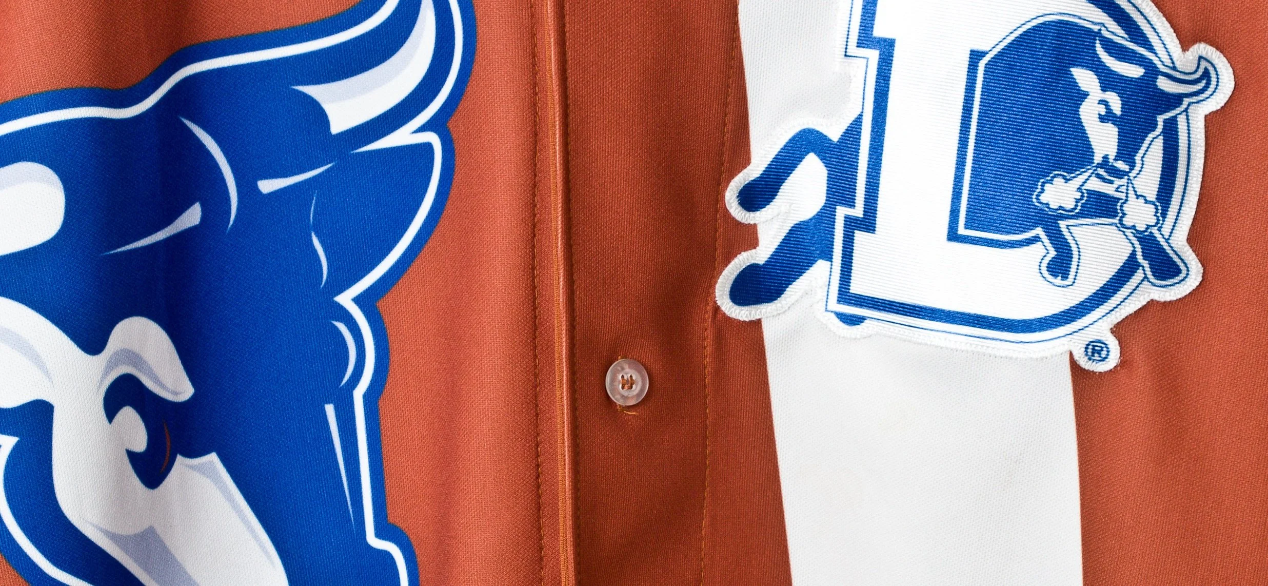
Based on the insights gathered from my research, I devised the final design, commencing with the sleeve. Drawing inspiration from iconic images of Michael Jackson adorned with a symbolic band on his arm, signifying the plight of children globally, I found a poignant connection to integrate the North Carolina Coalition Against Domestic Violence into the jersey.
In homage to the sport of baseball and channeling the retro aesthetic inspired by 60's mod dresses, a distinctive line was introduced across the left chest. This deliberate placement on the left side ensured a harmonious coexistence with the pre-specified location of the Durham Bulls logo, as pre-specified by the organization.
To achieve visual balance, the Durham Bulls logo was strategically incorporated onto the right side of the jersey, contributing not only to a harmonious aesthetic but also evoking the timeless of the "Bull Durham" Ballpark.
Deliberating on the color palette, I opted to adhere to the existing Durham Bulls scheme, steering away from another blue jersey. Instead, I embraced their alternative home scheme, featuring a distinctive rustic orange as the primary hue and complementing it with white as the secondary shade. This selection served to culminate in the final rendition of the jersey, exemplified in its on-field presentation during the game.